A Message from our Communications Manager

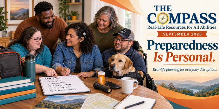
Newsletter header for The Compass, September 2026. A diverse group of adults with disabilities and supporters sit around a table creating an emergency plan. Visible items include a backpack, water bottle, pill bottle, flashlight, phone, notebook, map, and a service dog beside a man using a wheelchair. One woman has a visible hearing device. On the right, the newsletter title reads “THE COMPASS: Real-Life Resources for All Abilities,” with “September 2026” and the theme “Preparedness Is Personal. Real-life planning for everyday disruptions.” The design uses warm orange, blue, and cream tones with a scenic Tennessee-style landscape in the background. Pathfinder's compass branded graphic replaces the letter 'o' in the word "Compass."

Dear Compass Readers, Imagine driving home after a long day. You see flashing lights in your rearview mirror. You pull over, and suddenly you are being asked questions and given instructions while trying to process everything happening around you. Now imagine there is something important the officer needs to understand about you, but in that… Read more A Message from our Communications Manager
Spotlight: TEMA Accessible Emergency Information Designed with Disability in Mind – September 2026

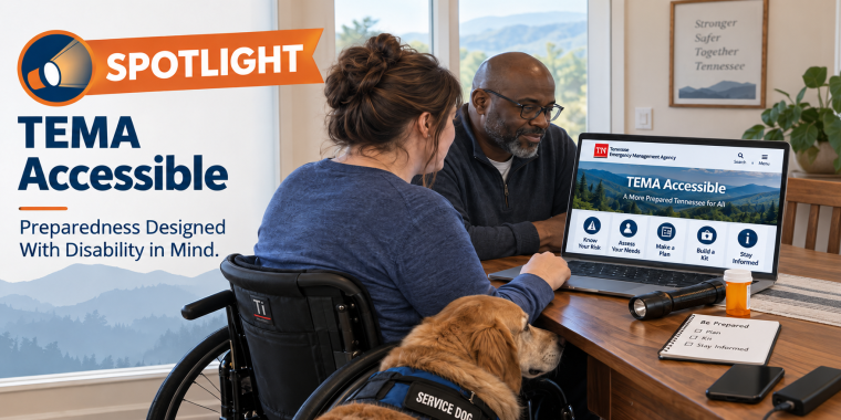
TEMA Accessible spotlight graphic featuring a woman who uses a wheelchair seated at a table with a Black man as they review the Tennessee Emergency Management Agency’s TEMA Accessible webpage on a laptop. A service dog rests beside her. Emergency planning items, including a flashlight, medication, phone, and preparedness checklist, are on the table. Text reads, “Spotlight: TEMA Accessible — Preparedness Designed With Disability in Mind.”

Knowing a preparedness resource exists is useful. Knowing how to use it before you need it is what can make the difference. The Tennessee Emergency Management Agency (TEMA) coordinates emergency preparedness, response, recovery, and mitigation efforts across the state. As part of that work, TEMA recognizes that emergency planning cannot take a one-size-fits-all approach. That… Read more Spotlight: TEMA Accessible Emergency Information Designed with Disability in Mind – September 2026

Navegando Juntos (Navigating Together) – September 2026

Navigando Juntos reconoce que encontrar recursos para discapacitados puede ser un desafío, especialmente cuando las diferencias en las habilidades, la cultura y el idioma crean barreras adicionales. Esta sección comparte herramientas prácticas, recursos confiables e información útil para facilitar la navegación por los servicios, empoderando a las personas y familias para encontrar el apoyo que… Read more Navegando Juntos (Navigating Together) – September 2026

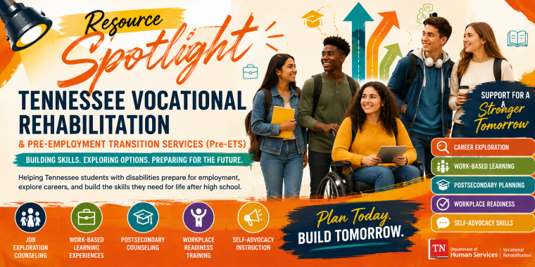
Spotlight: Tennessee Vocational Rehabilitation and Pre-Employment Transition Services (Pre-ETS)

A vibrant Resource Spotlight graphic for Tennessee Vocational Rehabilitation and Pre-Employment Transition Services (Pre-ETS). Diverse transition-age students, including a young woman using a wheelchair, stand together beside colorful arrows representing future pathways. Text highlights career exploration, work-based learning, postsecondary planning, workplace readiness, and self-advocacy, with the message “Plan Today. Build Tomorrow.” and Tennessee Department of Human Services/Vocational Rehabilitation branding.

Planning for life after high school can feel exciting, overwhelming, and uncertain all at once. Students may be thinking about work, training, college, transportation, or learning how to live more independently. Families may be asking what support is available and when the process should begin. In Tennessee, one important resource for that journey is Vocational… Read more Spotlight: Tennessee Vocational Rehabilitation and Pre-Employment Transition Services (Pre-ETS)

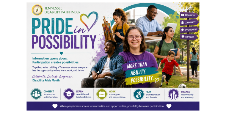
Finding New Possibilities Through Participation

This vibrant promotional graphic emphasizes disability pride and community inclusion, featuring a collage of diverse individuals, bold typography, and colorful accents like teal, purple, and lime green. The layout combines modern, nonprofit-style elements—photography, vector graphics, and watercolor splashes, to convey an inclusive, empowering message of accessibility, opportunity, and possibility for all.

Pride in Possibility Every July, Disability Pride Month invites us to celebrate something bigger than awareness. It celebrates identity, achievement, individuality, and the many ways people contribute to their communities. It reminds us that disability is not something to overcome. It is a natural part of the human experience. At Tennessee Disability Pathfinder, we see… Read more Finding New Possibilities Through Participation

Aging on Your Own Terms: Real Support for Real Life

An older Black couple sits side by side at a wooden table in a bright, warmly lit home. The woman, wearing a light blue shirt over a striped top, points toward a laptop screen while the man, wearing a dark blue button-up shirt, leans in and looks closely at the screen. Papers, a notebook, and a coffee mug are on the table, suggesting they are reviewing information together. The image conveys aging adults navigating resources, making plans, and seeking support in a calm, collaborative setting.

Aging looks different for everyone. For some, it means remaining active in the community, continuing to work, volunteer, travel, or spend time with family. For others, it may mean stepping into new roles, helping care for aging parents, navigating changing health needs, or trying to understand services and supports for the first time. And for… Read more Aging on Your Own Terms: Real Support for Real Life

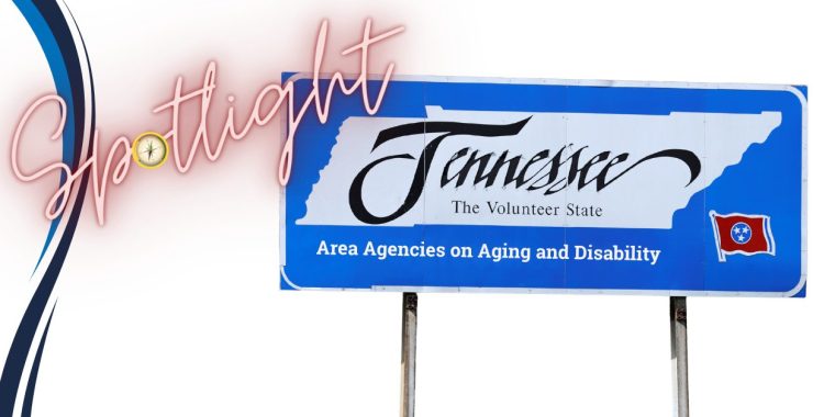
Spotlight: Tennessee’s Area Agencies on Aging and Disability – May 2026

A newsletter graphic with a white background and a large blue Tennessee highway-style sign on the right. The sign features the shape of Tennessee with the words “Tennessee, The Volunteer State” and the phrase “Area Agencies on Aging and Disability” in white text across the bottom. On the left side, the word “Spotlight” appears in large pink script lettering with the Pathfinder compass logo placed inside the letter design. Curved navy and blue accent lines run along the far left edge. The graphic introduces a spotlight section focused on Tennessee’s Area Agencies on Aging and Disability.

Where to Start: Tennessee’s Area Agencies on Aging and Disability When you’re trying to find support for yourself or someone you love, the hardest part is often knowing where to begin. That’s why one of the most important resources across Tennessee isn’t just a single program, it’s a network designed to help you navigate what’s… Read more Spotlight: Tennessee’s Area Agencies on Aging and Disability – May 2026

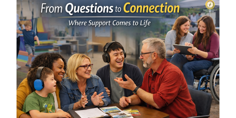
From Questions to Connection: Where Support Comes to Life

A diverse group of individuals and families sits together at a table in a welcoming community setting, speaking with a navigator while reviewing brochures and resources. A child wearing noise-reducing headphones sits beside a parent, while another adult gestures during conversation. In the background, a child participates in a sensory-friendly activity, and two women—including one using a wheelchair—review information on a tablet outdoors. The image represents connection, guidance, and real-world autism support across different ages, backgrounds, and disability experiences. Pathfinder's logo is on the top right of the image.

For many individuals and families, the journey with autism does not begin with a clear roadmap. It begins with questions. What does this mean? Where do we start? Who can help? Information is everywhere, but knowing what to do with that information is where many people get stuck. That’s where Tennessee Disability Pathfinder comes in.… Read more From Questions to Connection: Where Support Comes to Life

Discussing Autistic Traits

A wide horizontal illustration shows overlapping colorful profiles of people facing different directions, representing diverse perspectives and communication styles. Bright silhouettes in blue, orange, green, yellow, red, and gray are layered across the image, connected by dotted lines and floating icons such as hearts, light bulbs, and conversation bubbles. The flowing background transitions from blue to green, creating a sense of movement and dialogue. The image symbolizes varied ways of thinking, communicating, and understanding, reflecting respectful conversations about autistic traits and recognizing both strengths and support needs.

How we talk about autism matters. The words used to describe autistic traits can shape understanding, influence expectations, and impact how individuals are supported in everyday environments. Our partners at TRIAD have developed a thoughtful resource designed to help shift conversations toward language that reflects both strengths and support needs. The Discussing Autistic Traits tip… Read more Discussing Autistic Traits

When the Path Forward Isn’t Clear: Why the Right Information Matters

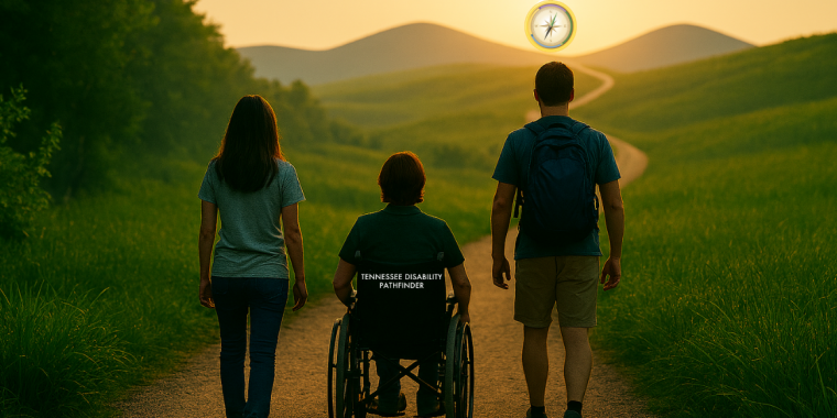
A scenic outdoor image showing three individuals traveling along a wide dirt path surrounded by tall green grass. The person in the center is using a wheelchair with “Tennessee Disability Pathfinder” printed on the back. The individuals on the left and right are walking beside the wheelchair user. The path leads toward rolling hills in the distance, with a warm golden sunset on the horizon. A circular Tennessee Disability Pathfinder compass logo appears in the sky above the hills.

  How Pathfinder walks with people, navigating complex situations, one question at a time. People often reach out to Pathfinder after they’ve tried everything they can think of. Search results conflict, eligibility language is dense, and “what to do next” isn’t obvious. Some are looking for developmental disability resources for the first time; others return… Read more When the Path Forward Isn’t Clear: Why the Right Information Matters